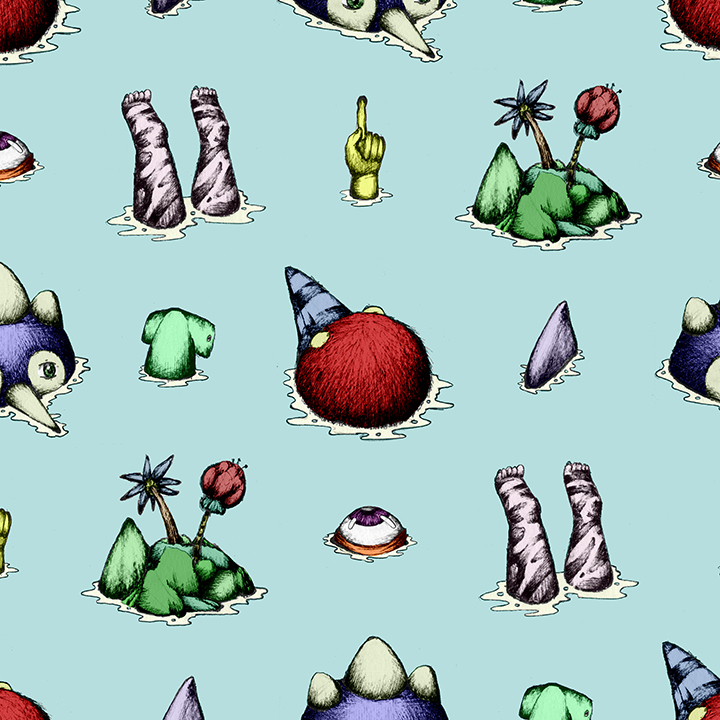
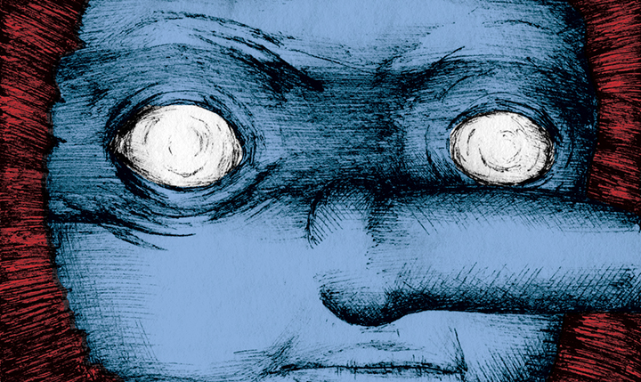
His works represent the surreal and unseen world filled with creatures, that to some of us look a bit scary and to others bring that curiosity of wanting to know what is behind them. The work of an artist Olf de Bruin has been published in such platforms as: HP/De Tijd, Vice Vormplatform, WeTransfer and others. Young designer already has developed a certain and exceptional style, which is noticeable in the illustration world. We talked with Olf about his surreal path in this mystical design world.
Olf, could you share with our readers what does graphic design and illustration world mean to you? What is the most fascinating thing about being an artist?
I see myself more as an illustrator then an artist, which is a great job to perform. It’s great to make articles more appealing, to create worlds that never existed or to draw the weirdest character. That’s what makes it so much fun to do.
What was the main reason why you have decided to work in the Illustration business?
When I was 17, I started studying Fine Arts, but after a couple of months I started to miss something. I missed the challenge of communication. So I switched to illustration which is all about communication. Graduating with my book ‘Van Bollebast tot Voortprinter’ I knew I wouldn’t want to do anything else.
Probably, one of the most important work is “Van Bollebast tot Voortprinter”, which introduces an interesting topic – transhumanism. What was the biggest challenge in the process of the project? Could you share with us about the concept of the book?
The purpose of the book was to shine a new light on transhumanism for me. In today’s topic about transhumanism I saw mostly people who were strongly against or strongly agreed. So I wanted to make a book that gave a new sound to this transhumanism, a more magical, funny and wonderful sound with a deeper layer and meaning behind it.
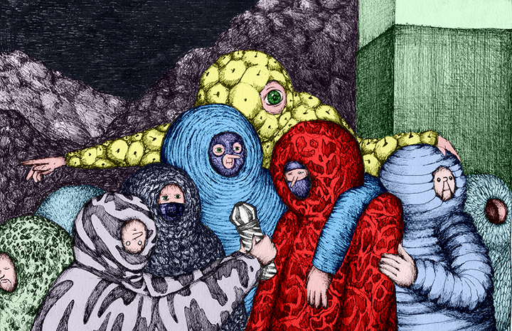
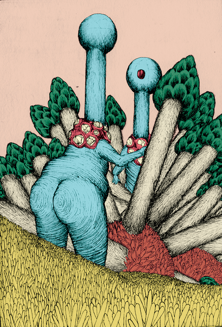
In the book I present 6 new species of human. Each adapted too current social and technical settings. Therefore, is the Bollebast, a human that due the lack of food and global warming decided to live from sunlight. With a new special type of skin, it can change sunlight in to powerful and tasteful glucose and oxygen. Just like we see from plants from today. Totally different is the Voortprinter, a human that has a build-in 3D-printer, so it doesn’t have to give birth anymore, it just prints it baby’s every day.
Your work is usually representing unrealistic creatures, figures which are represented in satirical, ironic moments, positions. Is there a particular message, theme, style that you like to show in your works?
There’s definitely not a message, unlike ‘Van Bollebast tot Voortprinter’, but more like a vibe that I’m trying to reach with every drawing I make. Wonderful, magical, unique, weird, funny, dreamy and so on are words that I would describe that vibe. It’s sounds so corny when I type this but it is what it is.
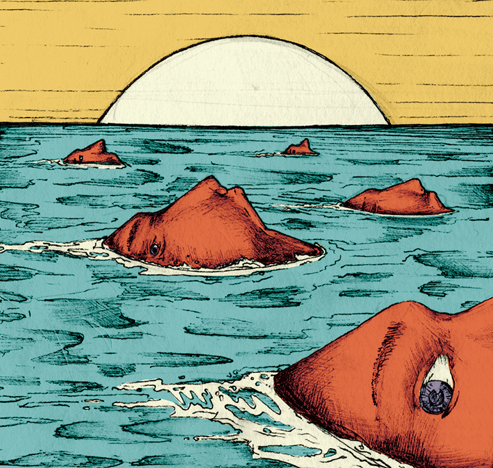
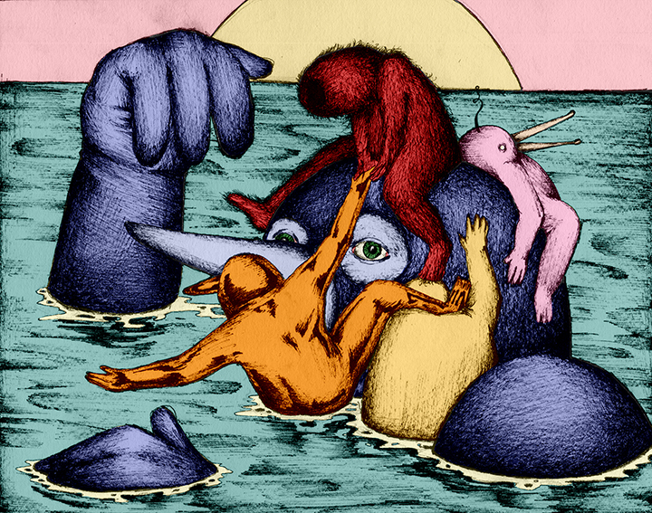
The illustrations “De Correspondent” represent the nature side, which in this case is the life under water. What was the technique that you used for these illustrations?
For these illustrations I just used pen and paper and scanned the drawings into my computer (like I always do). But to give it that underwater feeling, I inverted the colours which gave the illustrations some kind of weird and magical under water vibe. Really liked how this experiment came out.
What is the most memorable collaboration that you have done? What has it given to you as a designer?
Every collaboration is always great to do. Working together with editors who are trying to get the best out of me. Two of my favourite collaborations must be the EP-cover for the Dutch band John Coffey and the artwork I made for a festival called Wildeburg. What made them so special for me, was the great outcome of all my illustrations. Like for John Coffey to see my drawings back from the actual disc to the shirts on the shoulders of the fans. Or when I was walking in Amsterdam last month, and suddenly saw all my posters designed for Wildeburg back in the city. That’s a big reward for all the hard work I put into it.
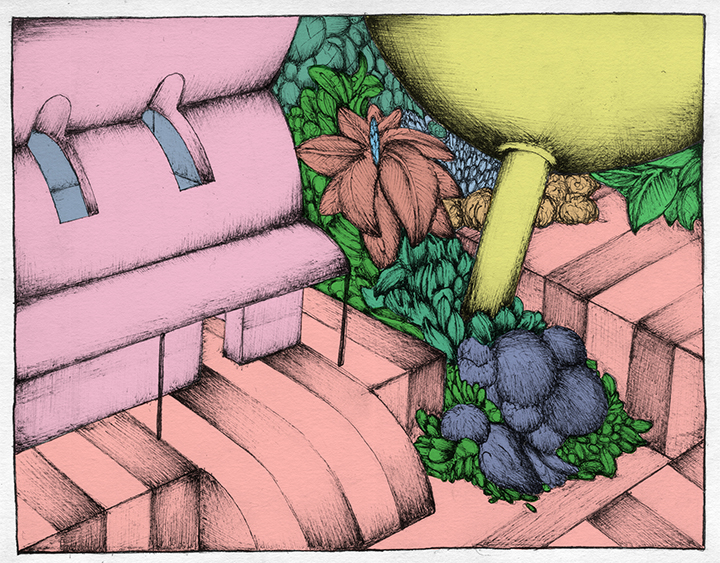
“De Correspondent” work tells us a story about a bizarre invested pipeline. How did you come up with a concept for this particular work? What is behind the concept?
This illustration was made for one of the best Dutch online journalistic platforms ‘De Correspondent’. They made an article about a bank which claims to be very green and aware of the environment. So you can call it kind of bizarre that a bank like this invests in a pipeline from Azerbaijan to Italy, that not green at all.
So I wanted to give this bizarre feeling of these big moving giants (the bank), that placed a pipeline in a weird landscape. If you look closely, you can see the map of Italy and Azerbaijan in it.
As a young designer, you have achieved a lot in your career. What are your future plans
There are currently a lot of future plans in my head. One of the things I really would like to do is to expand the way my illustrations are displayed, to make it as versatile as possible. Everything from posters, websites, mugs, clothing, vases, hats, prints, fenders, furniture, bikes, cars, planes, everything printed with my illustrations on it. To eventually really create my own Olf-world.

